624th played so far
Genre: Adventure
Platform: Various
Year of Release: 1993
Developer: Activision
Publisher: Infocom
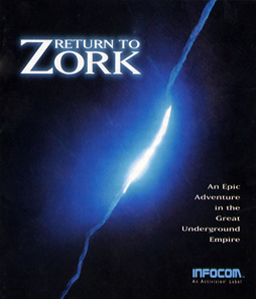
Zork is, as we’ve discussed before, one of the most important and best known text adventures. Return to Zork is a point and click instead, from a first person perspective, and with some live actors like we’ve seen in Gabriel Knight – though with pre rendered CGI backgrounds.
I’ve played a sequel to this, Zork Nemesis, and was (to be honest) horribly confused by it, but simultaneously enthralled by what was on offer. I hope this will do something similar.
Our Thoughts
I’m not sure this game comes across as well now as it did when it was first released. The combination of pre-rendered background with actors clearly shows how artificial the backgrounds are, while the graphics just can’t measure up. It’s a weird point, as I’m not sure what the game could have done here, even if released at another time.
Text adventures can have some interesting descriptions, designed to evoke the imagination rather than providing an exact visual. Creating those afterwards don’t necessarily look the best, and by giving more information you box them in as well. At several places in the game, the environments looked like they were trying to evoke these written images, without always pulling it off that well. It means some areas come across as bizarre and navigation can feel a bit odd because you jump from screen to screen, rather than moving there. Turning around especially led to some weird results.
This will be an issue in early Myst as well, but that game was fixed up. Here, obviously, little of that happened.
That doesn’t mean the game just plays as a text adventure with graphics. The use of live actors leads to a far more interesting dialog system. This involves letting them speak while you select your emotion, with the characters (sometimes) responding appropriately. As other adventures, they will also respond to items and such you show them, but you also get recordings of the things they say that you can play to other characters, and show them photos you take of locations. It creates loads of new options, not always as good as others (having to play audio clips over and over gets boring), but it feels deeper and seems intended to showcase all of these actors.
Beyond that, the game does play like a point and click adventure. Find items, find places to click, combine them, not always in obvious way. It seems like there are places where you can get stuck if you don’t do the right thing, but mostly it doesn’t kill you that quickly. There are still some death scenarios, but with saving you’d be fine. The difficulty is still there, but more accessible than the text adventures.
Final Thoughts
There were times where the game certainly confused me, and I’m still not quite sure what my goal was the whole time, but there was an interesting world to explore here with one of the more interesting dialog mechanisms in games. It’s doing its best to make use of the extra capabilities it has, even if it looks a bit worse now. If it had struck bigger, a remake at this point seems like it would well. For now, I need to gather more courage to try again.
